
I’m not sure when I first heard this quote, but it’s something that has stayed with me over the years. How do you create services for situations you can’t imagine? Or design products that work on devices yet to be invented?
Flash, Photoshop, and responsive design
When I first started designing websites, my go-to software was Photoshop. I created a 960px canvas and set about creating a layout that I would later drop content in. The development phase was about attaining pixel-perfect accuracy using fixed widths, fixed heights, and absolute positioning.
Ethan Marcotte’s talk at An Event Apart and subsequent article “Responsive Web Design” in A List Apart in 2010 changed all this. I was sold on responsive design as soon as I heard about it, but I was also terrified. The pixel-perfect designs full of magic numbers that I had previously prided myself on producing were no longer good enough.
The fear wasn’t helped by my first experience with responsive design. My first project was to take an existing fixed-width website and make it responsive. What I learned the hard way was that you can’t just add responsiveness at the end of a project. To create fluid layouts, you need to plan throughout the design phase.
A new way to design
Designing responsive or fluid sites has always been about removing limitations, producing content that can be viewed on any device. It relies on the use of percentage-based layouts, which I initially achieved with native CSS and utility classes:
.column-span-6 {
  width: 49%;
  float: left;
  margin-right: 0.5%;
  margin-left: 0.5%;
}


.column-span-4 {
  width: 32%;
  float: left;
  margin-right: 0.5%;
  margin-left: 0.5%;
}

.column-span-3 {
  width: 24%;
  float: left;
  margin-right: 0.5%;
  margin-left: 0.5%;
}
Then with Sass so I could take advantage of @includes to re-use repeated blocks of code and move back to more semantic markup:
.logo {
  @include colSpan(6);
}

.search {
  @include colSpan(3);
}

.social-share {
  @include colSpan(3);
}
Media queries
The second ingredient for responsive design is media queries. Without them, content would shrink to fit the available space regardless of whether that content remained readable (The exact opposite problem occurred with the introduction of a mobile-first approach).
Media queries prevented this by allowing us to add breakpoints where the design could adapt. Like most people, I started out with three breakpoints: one for desktop, one for tablets, and one for mobile. Over the years, I added more and more for phablets, wide screens, and so on.
For years, I happily worked this way and improved both my design and front-end skills in the process. The only problem I encountered was making changes to content, since with our Sass grid system in place, there was no way for the site owners to add content without amendi
Recommended Story For You :
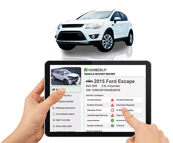
GET YOUR VINCHECKUP REPORT

The Future Of Marketing Is Here

Images Aren’t Good Enough For Your Audience Today!

Last copies left! Hurry up!

GET THIS WORLD CLASS FOREX SYSTEM WITH AMAZING 40+ RECOVERY FACTOR
Browse FREE CALENDARS AND PLANNERS
Creates Beautiful & Amazing Graphics In MINUTES

Uninstall any Unwanted Program out of the Box